- Key Takeaways
- Why Pop-Up Design Needs a User-First Approach
- Start With the Visitor’s Goal
- Choose the Right Pop-Up Type
- Write Short, Clear Pop-Up Copy
- Make the Choice Feel Balanced
- Design for Mobile First
- Mobile Pre-Publish Checklist
- Use Timing and Frequency With Care
- Build Accessibility Into the Design
- Keep Animation Calm and Purposeful
- Connect the Pop-Up to the Page
- Measure Helpfulness, Not Just Clicks
- Test One Change at a Time
- Common Pop-Up Mistakes to Avoid
- Conclusion: Let the Content Lead
Key Takeaways
- Helpful pop-ups support a clear visitor goal instead of interrupting it.
- Clear copy, an obvious close option, and balanced choices build trust.
- Mobile layout, accessibility, timing, and frequency rules matter as much as visual style.
- Measure meaningful outcomes, not clicks alone.
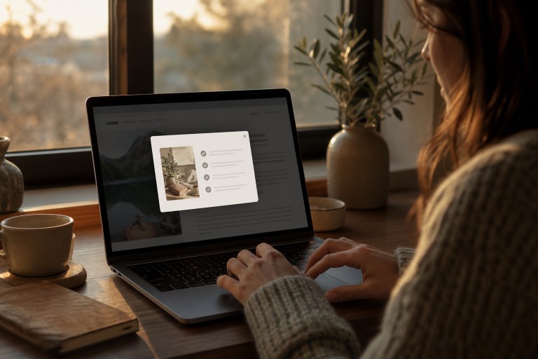
Website pop-ups are not automatically bad. When they appear at a useful moment and make a task easier, they can help people save an offer, download a resource, confirm a setting, or continue an action.
Reviewing strong examples of pop up design can help teams see how concise messages and clear controls create a calmer experience. The problem begins when a prompt blocks content before visitors have had a chance to understand the page. A user-first pop-up should feel like timely assistance, not a toll booth placed in front of an article, product page, or booking form.
Why Pop-Up Design Needs a User-First Approach
A pop-up has to earn the attention it requests. Someone reading an article may welcome a related checklist after reaching the middle of the page, while that same person will likely resent a newsletter form that covers the screen on arrival.
Google notes that intrusive dialogs can frustrate users, obscure content, and make it harder for search engines to understand a page, so teams should follow its guidance whenever a smaller, less disruptive option is available.
Start With the Visitor’s Goal
Before selecting colors, motion, or button styles, identify what the visitor came to do. Common goals include reading a guide, comparing products, booking an appointment, downloading a template, joining an email list, or saving account preferences.
Context determines whether the message is useful. A newsletter invitation that appears after a reader has viewed several sections of a detailed guide can offer a relevant next step. The same invitation shown immediately can prevent the reader from deciding whether the content is worth their time.
Choose the Right Pop-Up Type
- Modal window: Best for focused tasks, such as confirming a deletion or completing a required step.
- Slide-in panel: Useful for smaller offers or reminders that should not take over the page.
- Bottom banner: A practical choice for notices, preferences, and brief calls to action.
- Exit-intent prompt: Can be useful when it presents genuine value, not a last-second distraction.
- Inline prompt: Often the least disruptive option because it stays in the natural page flow.
Write Short, Clear Pop-Up Copy
Effective copy answers four questions quickly: why is this message appearing, what does the visitor gain, what happens after the click, and how can they decline? Use one primary action whenever possible, and make every label truthful.
For example, replace “Don’t miss out” with “Get the monthly home repair checklist by email.” The revised version names the benefit and sets a realistic expectation. A secondary choice, such as “No thanks, keep reading,” is equally clear and does not shame the visitor for declining.
Make the Choice Feel Balanced
Visitors should never have to decode the interface. “Continue” should not mean “start a paid subscription,” and a close icon should actually close the window. Avoid hidden dismiss controls, unequal button treatment, repeated prompts after a refusal, misleading countdowns, and unexpected charges or subscriptions. These practices can become manipulative rather than persuasive.
Design for Mobile First
A desktop pop-up that occupies a modest part of the screen can cover nearly everything on a phone. Keep mobile messages short, use large tap targets, leave space around form fields, and keep the close control visible without scrolling. Test portrait and landscape layouts, browser zoom, slow connections, and keyboards that may cover lower-screen buttons.
Mobile Pre-Publish Checklist
- Does the prompt leave enough of the page visible for orientation?
- Can users tap every button without accidental presses?
- Can they close it immediately and return to the same place on the page?
- Does it avoid horizontal scrolling, forced zooming, and oversized forms?
Use Timing and Frequency With Care
Timing should match a meaningful signal. Consider showing a prompt after someone reads part of a page, completes an action, returns to the site, views a relevant item, or reaches a seasonal account event. Exit-intent messages should be reserved for offers that genuinely help a departing visitor.
Set frequency limits. If someone closes a prompt, do not show it again on the next page or moments later. Respecting a clear “no” reduces irritation and gives visitors control over their browsing experience.
Build Accessibility Into the Design
Accessibility belongs in the first draft. Use sufficient color contrast, descriptive buttons and field labels, visible keyboard focus states, and understandable error messages. When a modal opens, keyboard focus should move into it and remain there until the dialog closes. Support the Escape key when appropriate, and test with a keyboard, screen reader, browser zoom, and reduced-motion settings.
Keep Animation Calm and Purposeful
Motion can guide attention, but it should not demand it. A brief slide-in is usually easier to process than a full-screen animation that interrupts reading. Avoid flashing effects, do not delay the close option, and honor reduced-motion preferences. Animation should clarify a change, not hide important information or pressure a decision.
Connect the Pop-Up to the Page
Relevance makes an interruption more defensible. A visitor reading about home repairs may appreciate a related maintenance checklist, but not an unrelated service offer. Useful targeting signals include the page topic, referral source, new-versus-returning status, products viewed, previous choices, device type, and stage in the customer journey.
Measure Helpfulness, Not Just Clicks
A high click rate can be misleading because some visitors click only to dismiss an obstructive window. Track completion rate, close rate, form errors, return visits, unsubscribes, time spent after interaction, support requests, and conversion quality. Compare performance with a version without a pop-up to determine whether the prompt creates real value or adds noise.
Test One Change at a Time
- Choose one visitor-centered goal.
- Define the audience and the page context.
- Create a simple version with clear copy and an easy exit.
- Test one variable, such as timing, headline length, form size, button wording, placement, or frequency.
- Review mobile, accessibility, and no-pop-up control results before keeping the change.
Common Pop-Up Mistakes to Avoid
- Showing a prompt before visitors see useful content.
- Asking for more information than the action requires.
- Stacking several messages over the main navigation.
- Using vague claims, hard-to-find close controls, or repeated requests.
- Ignoring small screens, slower connections, and accessibility needs.
Conclusion: Let the Content Lead
The best pop-up feels like a helpful next step, not a roadblock. Give visitors a clear reason to act, enough information to choose freely, and an effortless way to continue browsing. Thoughtful timing, honest copy, mobile care, accessibility, and balanced testing can turn a small interface element into a better experience for everyone. A well-designed pop-up should complement the visitor’s journey rather than interrupt it at the wrong moment.
Keeping the message relevant, limiting unnecessary distractions, and providing a clear way to close or dismiss the pop-up help build trust. When pop-ups are designed with user needs in mind, they can encourage meaningful engagement, improve conversions, and support business goals without creating frustration or disrupting the overall browsing experience.
Also read: How to Create a High-Converting Marketing Website: A Practical Guide